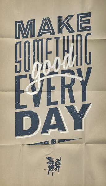
Today’s design inspiration is a poster which uses a lot of neat techniques that I thought I would feature. This poster uses a few techniques to give it a unique look. First, the designer used textures pretty effectively, both in as the paper background and also within the typography. Using that consistency helps give the poster the feel of one, harmonious design. Sometimes if elements like that aren’t followed throughout the entire design, it gives the appearance of disconnect.
The next thing I noticed about the poster was the fact that it follows the trend that a lot of designers are taking right now and that’s using multiple fonts with a small amount of words. What makes this design so successful to me is how they placed the word ‘good’ into the design. All of the other fonts, though different, are sans-serif, fairly straight-lined letters in blue. The word good is not only placed on top of the letters but the designer also introduced more of a handwriting style font and rather than outlining blue text, used white to distinguish it from the other words. It helps add emphasis to making something GOOD rather than just making something.
The last thing I want to touch on is the use of a mockup template. I’ve written a post about using mockups before and this is a great example why. To me it would make sense for the designer to use a template to give the paper that folded aesthetic. If a mockup wasn’t used, then even more credit to the designer as it came out very successful and gives it that worn paper look.
As I’m sure most of you know, I can’t end without talking about the actual content. Make something good every day. Not just something. Something good. Sometimes doing similar work on a daily basis can be monotonous, however striving to push yourself to do one good piece of design will help you and your team push the limits of your design. (via From Up North)


