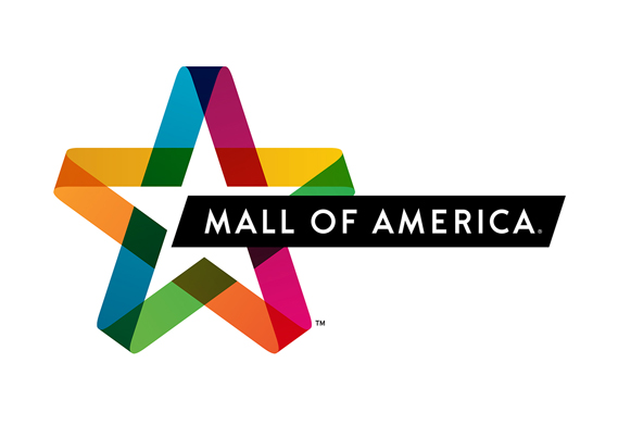
Today’s design inspiration focuses on the new identity for Mall of America, the largest mall in America which is complete with a waterpark, rollercoasters, and anything else you can imagine. Some of you may be familiar with the old identity, which the new design is based off of. When you have an established brand, it’s important to keep elements that your customers can relate to which makes doing these identity refreshes or a re-branding very difficult, leaving customers vocal about their feelings. Some of the more popular refreshes as of lately have been Wendy’s, Arby’s and the one met with the most resistance, University of California.
What I like about this specific rebranding is the fact that Duffy and Partners (the firm responsible for the new design) took all of the existing elements from the current logo and simply modernized every piece from top to bottom. The star and ribbon combination that were set above the text were one combined shape, with a star in the middle and having the waving ribbon extending to the left and right. The new design also features them together, but in a more simplistic and cohesive way. The star is made from these ribbon-like pieces overlapping each other. As you’ll see in the entire new identity, these ribbons are carried through the design. The ribbons are more reminiscent of actual ribbons that you would find on a gift wrapped box, rather than the ribbons that were previously extended from the star. The colors used in the star come from a fairly popular design style now, featuring overlapping colors with their opacity dropped to make a combination of the colors on the overlapped section. I like this style and have seen quite a few successful logo designs using this technique. It really helps give the logo more depth and more of an interesting look.
Moving on to the text, the use of ‘small caps’ has been removed from the word America which was set to fit in with the shape of the star. The rest of the text in the name was kept in all caps which I do like. It definitely works with the new and much improved sans-serif font selection. The original serif font was very dated so this new and improved modern-looking font is well over-due. The text sits on top of an angled rectangle, both overlapping the star. This area also helps add some depth to the design without adding drop-shadows and other effects that would take away from the simplistic approach.
Overall, I was really impressed with this new identity. I like how the identity is used on the mockups to show how these elements can be used in various ways, all while keeping this new identity. What did you think, was this a successful rebrand or do you think they’re taking away from the brand? (via Creative Review)


Comment:
Duffy & Partners Revitalizes Mall of America Brand with New, Dynamic Identity | Roepke Public Relations
[…] Designer’s Toolkit, You the Designer, The San Francisco Egotist, Media Bistro, The Dieline, JS Design, Graphic Design, Chain Store Age, Star Tribune, Popsop, HOW Design Blog, Design Week, Brand New, […]