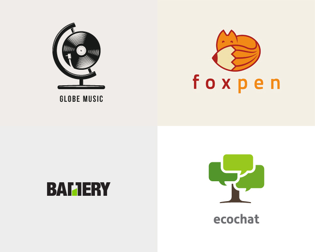
For today’s design inspiration, we’re going to look into the state of logo design and take a peek at a few examples of successful logo designs. I’ve seen 2 main trends lately in the field of logo design. The first technique is using positive and negative space to create a visually appealing icon graphic and the second is using a combination of graphical elements merged together into a single graphic, using subtleties to make an impact. We’re going to look at a few more of the latter, which typically are two-word company names. You’ll see a few examples above such as ‘Globe Music’ and ‘Fox Pen’ which take an element from each word and combine them into one graphic.
I’m really a fan of this style, but it takes a lot to pull this off. First of all, you need to be doing work for a company with a great name. I don’t know about you, but I’ve never had a client let me pick the name for their business/product. Then, you need to have a client who is open to letting you do your job. This sounds like a no-brainer, but I have had clients that think they know what will represent their company best and want you to create what’s in their head, no if’s, and’s or but’s about it. I feel like we all go through that in the early stages of our career. This is where finding out about your potential clients comes into play. I always go back to relating designers to doctors, hear me out. You don’t go to a doctor’s office, tell him your symptoms AND tell him how to treat those symptoms. Why would you tell a designer what you’re looking for and then tell him exactly how to solve the problem of what that will mean visually? As a designer, you have to make sure you have the respect of your clients to have open communication about what works and what doesn’t. This goes for every project, every client, every interaction you have.The final thing you need is a great vision to see things as pieces of a puzzle rather than an image as a whole. You need to be able to break down words into word bubbles and see the different meanings/aspects of them. This takes time and experience and like I said, it takes a lot to pull this off.
Back to the logos. You’ll see that in each of the above, the designer used elements from both words in the company name or in the case of ‘Battery’ above, that designer used the text to create negative space which was then paired with the green shape representing a battery level. For ‘Globe Music’ the designer took the stand from a typical globe and then used the record player for the globe. This is where seeing things outside of the box comes into play. The name of the company isn’t ‘Globe Records’ so for the designer to make it work, he went to the record to represent music which is round and resembled the globe. Same thing goes for the ‘Ecochat’ logo. This one is a little more straight-forward, but the designer went to a tree to represent the “eco” part of the logo. They then used green chat bubbles to create the top of the tree which I think was pretty successful.
All of the above logos seem to just work. There’s nothing that’s excessively flashy about them, but they’re unique and represent the company. That’s exactly what you look for when you’re creating a logo. These are just 4 of the full collection that I found and if you’re into logo design, I definitely recommend checking the rest out.
(via Design You Trust)

