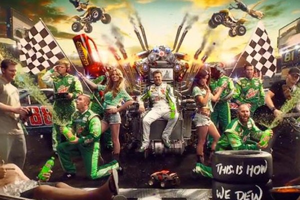
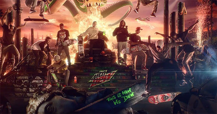
Today came across a great piece that covers Mountain Dew’s new advertising campaign that combines print, TV, and interactive aspects. The name of the campaign is “Living Portraits” and the style of the campaign is exactly that. There’s a video shot in slow-mo that gets more complex as it zooms out. There’s no text flying across the screen, no extra animations besides what brings the scene to life. By the time it gets to the end right before a cut to the product shot, it’s just one massive “portrait” that can be used in a print campaign. The third level of dimension is when you add in the interactive element. If you watch the videos on Mountain Dew’s website, you’ll be able to interact with elements of the still frame that relate to each athlete’s life. You’re prompted with a bunch of little + signs that when click, expand and give you a description of how they relate to the athlete. The thought of this is a genius branding concept and I think it was executed extremely well. The videos work as commercials, the still frame works as a print ad, the interactive level adds fun and depth to the campaign and they all work together perfectly to feature the Mountain Dew brand.
There’s another really good article on this campaign over at AWSC, you should check it out. You can watch the video below to get a better understanding of how it all came together and head over to Mountain Dew’s page to play with the interactive elements.


